Navigation
Living Apps Core SDK provides a navigation framework that will make it easier to focus DOM elements using remote control
Navigable elements
Add .la-navigable class to those elements you want to be navigable and set the data attributes
data-updata-rightdata-leftdata-down
to define how the focus will change when the user presses right/left/up/down while a DOM element is focused.
data-{up|right|down|left} attribute should be the id of another DOM element
Then, you can use .la-navigable:focus selector to define the style for the focused element:
.la-navigable:focus {
  border: 8px solid MediumVioletRed;
}
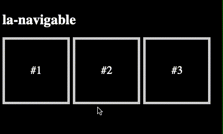
This React App:
export function App() {
  return (
    <>
      <h1>la-navigable</h1>
      <main>
        <div
          id="elem-1"
          className="la-navigable"
          data-right="elem-2"
          data-left="elem-3"
        >
          #1
        </div>
        <div
          id="elem-2"
          className="la-navigable"
          data-right="elem-3"
          data-left="elem-1"
        >
          #2
        </div>
        <div
          id="elem-3"
          className="la-navigable"
          data-right="elem-1"
          data-left="elem-2"
        >
          #3
        </div>
      </main>
    </>
  );
}
Renders the following:
Focus
use laSdk.focus() and laSdk.focusedElement to focus DOM elements programmatically.
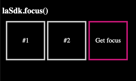
This React App:
export function App() {
  const ref = useRef(null);

  useEffect(() => {
    if (ref.current) {
      laSdk.focus(ref.current);
    }
  }, []);

  return (
    <>
      <h1>laSdk.focus()</h1>
      <main>
        <div className="la-navigable">#1</div>
        <div className="la-navigable">#2</div>
        <div ref={ref} className="la-navigable">
          Get focus
        </div>
      </main>
    </>
  );
}
Renders the following:
Scrollable: rows & columns
Unfortunately, the STB browser does not support Element.scrollIntoView() method. However, the Living Apps SDK Navigation framework provides an easy module to create scroll experiences in your navigable elements.
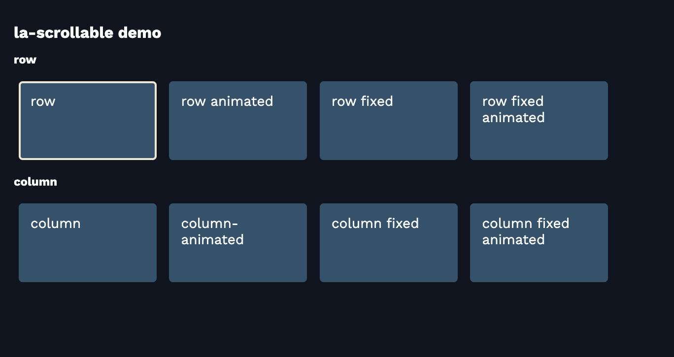
la-scrollable is a tool for creating standard navigation with rows and columns, similar to what you're accustomed to seeing in TV apps. Check out our live demo for HTML examples with various navigation experiences.
.la-scrollable
Add .la-scrollable class to the parent element of your .la-navigable child elements, the SDK will do the rest.
NOTE: Elements with la-scrollable class must not have position: absolute
The data-la-scrollable-offset attribute can apply some extra space (in px) to the scroll.
<div
  id="parent"
  class="row"
  class="la-scrollable"
  data-la-scrollable-offset="48"
>
  <div id="elem-1" class="item la-navigable" data-right="elem-2">Element 1</div>
  <div id="elem-2" class="item la-navigable" data-left="elem-1">Element 2</div>
</div>
.row {
  width: 200px;
  display: flex;
  overflow: hidden;
}

.item {
  flex-shrink: 0;
}
.la-scrollable-fixed
By adding .la-scrollable-fixed class to your .la-scrollable element, the scroll behavior ensures that the focused element remains completely fixed in place.
<div id="parent" class="la-scrollable la-scrollable-fixed">
  <div id="elem-1" class="la-navigable" data-right="elem-2">Element 1</div>
  <div id="elem-2" class="la-navigable" data-left="elem-1">Element 2</div>
  <div style="width: 200px; height: 1px; visibility: hidden"></div>
</div>
Include an additional non-navigable item child to occupy the extra space, ensuring that the last elements maintain their fixed scrolling behavior.
<div style="width: 200px; height: 1px; visibility: hidden"></div>
.la-scrollable-animated
The .la-scrollable-animated class enables a smooth scrolling effect. You can customize the animation speed by adding the data-la-scrollable-animation-step attribute (default is 30).
<div id="parent" class="la-scrollable la-scrollable-animated">
  <div id="elem-1" class="item la-navigable" data-right="elem-2">Element 1</div>
  <div id="elem-2" class="item la-navigable" data-left="elem-1">Element 2</div>
</div>
The la-scrollable-animating class is applied to the scrollable element during animation. This class can be utilized to enhance user experience, such as hiding the focus border while the animation is in progress:
.la-scrollable-animating .item {
  border-color: transparent;
  transition: border-color 0s;
}

.item:focus {
  border-color: white;
  transition: border-color 0.5s;
}
.la-scrollable-lazy
When dealing with a large number of scrollable items, it's crucial to prioritize performance by loading only the items that fit on the screen. Thanks to .la-scrollable-lazy class, the SDK automatically detects additions or removals of children elements and adjusts the scroll position accordingly.
Example: a thousand items row using React.js
const list = new Array(1_000).fill(null); // huge list

function ScrollableLazyDemo() {
  // store current index on the state to re-render while navigating.
  const [currentItemIndex, setCurrentItemIndex] = useState(0);

  return (
    <div
      className="la-scrollable la-scrollable-lazy"
      onScroll={(event) => {
        // don't change the currentItemIndex state until the scroll ends

        const isBeingAnimated = event.currentTarget.classList.contains(
          'la-scrollable-animating',
        );

        if (!isBeingAnimated) {
          // extract item index from data-index attribute
          const index = laSdk.currentFocus?.dataset.index;

          if (index) {
            setCurrentItemIndex(+index);
          }
        }
      }}
    >
      {list.map((_, i) =>
        {/* render only 10 items on each side */}
        Math.abs(currentItemIndex - i) > 10 ? null : (
          <div
            key={i}
            data-index={i} {/* store item index */}
            style={{ marginRight: '10px' }}
            id={`item-1-${i}`}
            className="la-navigable"
            data-right={`item-1-${i + 1}`}
            data-left={`item-1-${i - 1}`}
          >
            {i}
          </div>
        ),
      )}
    </div>
  );
}
Example: a thousand items grid using React.js
const VISIBLE_ROWS = 10
const COLUMNS = 5
const list = new Array(1_000).fill(null); // huge list

function getRowIndexFromItemIndex(i) {
  return Math.floor(i / COLUMNS)
}

function GridDemo() {
  // store current index on state to re-render while navigating.
  const [currentRowIndex, setCurrentRowIndex] = useState(0);

  return (
    <div
      className="la-scrollable la-scrollable-lazy"
      style={{
        width: '1920px'
        height: '600px',
        display: 'grid',
        gridTemplateColumns: `repeat(${COLUMNS}, 300px)`
      }}
      onScroll={(event) => {
        // don't change currentItemIndex state until scroll ends

        const isBeingAnimated = event.currentTarget.classList.contains(
          'la-scrollable-animating',
        );

        if (!isBeingAnimated) {
          // extract item index from data-index attribute
          const index = laSdk.currentFocus?.dataset.index;

          if (index) {
            const rowIndex = getRowIndexFromItemIndex(+index)
            setCurrentRowIndex(rowIndex);
          }
        }
      }}
    >
      {list.map((_, i) =>
        {/* render only 10 items on each side */}
        Math.abs(currentRowIndex - getRowIndexFromItemIndex(i)) > VISIBLE_ROWS ? null : (
          <div
            key={i}
            data-index={i} {/* store item index */}
            id={`item-${i}`}
            className="la-navigable"
            data-down={`item-${i + COLUMNS}`}
            data-up={`item-${i - COLUMNS}`}
            data-right={`item-${i + 1}`}
            data-left={`item-${i - 1}`}
          >
            {i}
          </div>
        ),
      )}
    </div>
  );
}
Combining options
Use | to provide multiple options for data-<direction> attributes: data-up=id1|id2|id3|id4.
The navigation framework will focus on the first element found on DOM.
Navigation Proxy
<div id="element" class="la-navigable" data-proxy="another-element"></div>
When element gets focused, it'll proxy focus to another-element directly.
Events
Use onfocus and onblur event handlers to code your custom logic when a DOM element gets focused or blurred.
React Example:
<div
    id="main-button"
    class="la-navigable"
    onFocus={(ev) => {
        console.log('focus!')
    }}
    onBlur={(ev) => {
        console.log('blur!)
    }}
>
    Focus me!
</div>